
 |
| Image by GCFLearnFree.org |
by Peggy Robin
If you are have been reading the Cleveland Park Listserv for
any length of time, you will be aware of its poverty of fonts. If you receive
in “daily digest” format (the last 15 messages received in one long email from
Yahoogroups), you get the whole thing in just one font -- always the same stripped-down sans serif font each time, without any effects whatsoever – no italics,
no boldfacing, no highlighting, no emojis 😏.... Nada (and that’s
not even a font name). If you get individual messages you are getting your messages converted into whatever your email program has as its
default font – unless there’s something in your email system that doesn’t mesh
with the Yahoogroups system, in which case you may sometimes receive a garble
of strange symbols. (The most often happens when there's an apostrophe in the subject
line, which for some reason, does not come across correctly for most recipients.) This
is because the Yahoogroups system is so ancient and decrepit, and the various attempts to
upgrade it over the years have been so poorly executed, that it’s still stuck
with the font limitations of a bygone era.
I often write to would-be posters to let them know that they
have sent in a message to the listserv in a font that the system does not
recognize and cannot process correctly – and so it appears as a blank box in the “pending
messages” folder. I used to think that the extremely small number of compatible
fonts was an unfortunate limitation on our posters, but just recently I was
struck with the realization that it’s actually a blessing. And that blessing
is….no one can post a notice in a really stupid, childish, or hideous font.
What are the fonts that merit these descriptors?
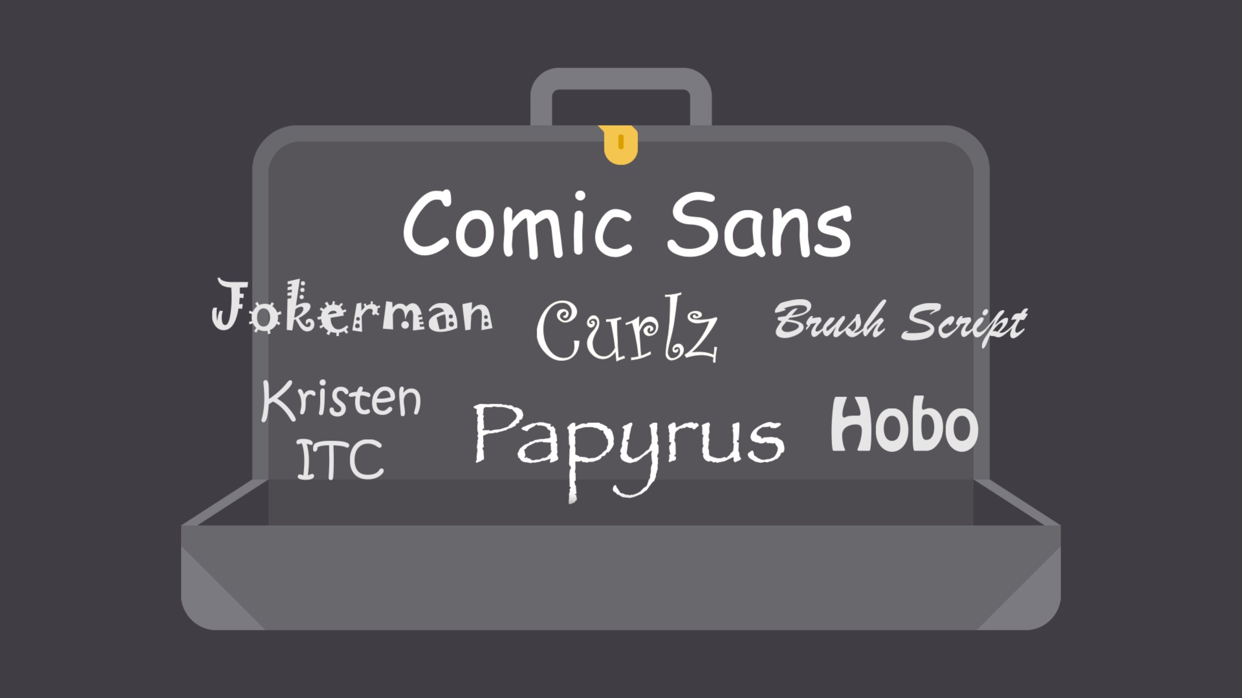
It’s easy to find typographers’ lists of the “10 Most Hated
Fonts” – here’s just one example http://www.topdesignmag.com/top-10-most-notoriously-hated-fonts/
-- but the lists seldom agree on even five out of the ten. Still, certain trends
emerge: Comic Sans will most often occupy the number one spot. Papyrus is usually
there, along with Brush Script. Some ungainly variant of Helvetica, like Gill Sans, may be on the list (while Helvetica itself is almost always near the top
of a “10 Best Fonts” list).
What made me aware that the CP Listserv’s dearth of fonts is
actually a virtue, not a flaw? It was this sketch on Saturday Night Live last
weekend (9/30/17) – something I instantly recognized as the single best non-political font-based comedy in the show’s 42-season
history:
----------------------------------
Still Life with Robin is published on the Cleveland ParkListserv and on All Life Is Local on Saturdays.
Brilliant, Peggy!
ReplyDeleteThanks! I thought I'd get cute and reply in Papyrus, followed by Brush Script, and Comic Sans, but this blog platform does offer any of those fonts...and I think I'm grateful for that!
ReplyDelete